Math 1153 - 13 October 2026 - Chapter 6
 Watch on YouTube →
Overview
Mike Jacobsen reviews Chapter 6 association and correlation, using a 12-year dataset of online-fraud losses from 2001–2012 to practice calculator scatter plots and describe direction, form, strength, and outliers. He explains the Pearson correlation coefficient’s range and limitations, connects its calculation to paired z-scores, and demonstrates the TI-84 setup for reporting r before previewing linear regression in Chapter 7.
Key takeaways
- Before interpreting Pearson’s r, inspect the scatter plot: r measures linear association, so a curved relationship can make its value misleading.
- Pearson’s r ranges from −1 to +1, and its sign matches the direction of a linear relationship: positive for an upward trend and negative for a downward trend.
- A standardized paired observation contributes the product zₓzᵧ to the correlation formula; points on opposite sides of the two means contribute negative products.
- In the 2001–2012 online-fraud example, losses generally rise and level off, while the unusually low 2010 value stands out as a possible outlier.
- On a TI-84, enable DiagnosticOn through the catalog, then use STAT → CALC → LinReg(a+bx) with L1 and L2 to display the correlation coefficient.
- A rule-of-thumb judgment about correlation strength must account for context: a small association could be useful in one application and inadequate for high-stakes engineering.
Chapters
0:00
Exam 2 Schedule, Calculator, and Study Plan
- Exam 2 can be scheduled Monday, October 19 through Thursday, October 22; students should check the updated Canvas and ICU Gmail instructions.
- A calculator is required, and Mike Jacobsen recommends bringing one rather than relying on a possible testing-center spare.
- The permitted notes sheet may be printed or handwritten on both sides; handwritten notes must be in pen.
- Jacobsen recommends catching up on quizzes and MyLab homework before practicing with the sample exams.
4:26
Online-Fraud Dataset: Explanatory and Response Variables
- The example pairs years 2001–2012 with annual online-fraud losses measured in billions of dollars.
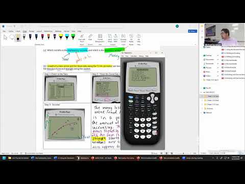
- Year is the explanatory variable and belongs in calculator list L1 and on the horizontal axis; fraud loss is the response variable and belongs in L2 and on the vertical axis.
- Each year must stay paired with its corresponding loss—for example, 2007 matches $3.7 billion, not the next year’s value.
6:09
TI-84 Scatter-Plot Setup and Data Entry
- Turn on Stat Plot once by pressing 2nd and Y=, selecting Plot1, and ensuring the plot is on and set to the scatter-plot icon.
- Enter the 12 years in L1 and the matching fraud-loss figures in L2 using STAT and Edit.
- Jacobsen repeats the setup after a screen-sharing problem and clarifies that STAT alone opens the list editor.
13:38
Use ZoomStat to Display the Scatter Plot
- After entering both lists, press ZOOM and choose option 9, ZoomStat, to fit the calculator’s viewing window to the data.
- The resulting scatter plot is a time-series plot because the horizontal variable is year, while remaining a scatter plot of paired numerical values.
- The calculator workflow is summarized as entering the data, selecting ZoomStat, and viewing the plotted result.
16:29
Describe the Fraud-Loss Trend: Direction, Form, and Strength
- From 2001 to 2012, online-fraud losses generally rise, so the overall direction is positive.
- The pattern grows steadily at first and then levels off in later years, supporting a nonlinear description rather than a simple straight-line trend.
- The relationship appears stronger early in the series and more variable later, so its visual strength weakens over time.
- The 2010 loss is unusually low compared with neighboring years and is identified as a possible outlier.
27:46
Pearson’s r Measures Linear Association
- The Pearson sample correlation coefficient, denoted r, summarizes the direction and strength of a linear relationship between two numerical variables.
- Its values range from −1 to +1: values near +1 indicate strong positive linear association, while values near −1 indicate strong negative linear association.
- Jacobsen stresses that r does not measure nonlinear association; calculating it for curved data can produce an uninformative result.
31:49
Classify Scatter Plots Before Interpreting r
- The worked graph examples distinguish no apparent relationship, linear relationships, and a clearly curved nonlinear relationship by asking whether a straight line fits the points reasonably well.
- For linear plots, rising points indicate a positive relationship and falling points indicate a negative relationship; r has the same sign as that direction.
- For the nonlinear curve, the points still have an overall direction, but students should not assign r a positive or negative interpretation because the linear statistic is inappropriate.
42:00
The Correlation Formula Standardizes Both Variables
- Jacobsen presents r as the sum of paired products of standardized x- and y-values divided by n − 1.
- Each z-score subtracts its variable’s mean and divides by its standard deviation: x uses x̄ and sₓ, while y uses ȳ and sᵧ.
- The formula provides a conceptual explanation of correlation even though the calculator will do the arithmetic.
45:38
Use x̄ and ȳ to Determine Z-Score Signs
- A point above ȳ has a positive y z-score; a point below ȳ has a negative y z-score.
- A point to the right of x̄ has a positive x z-score; a point to the left has a negative x z-score.
- Drawing the x̄ and ȳ reference lines divides a scatter plot into regions that reveal the signs of each point’s paired z-scores.
47:38
How Paired Z-Score Products Reveal Correlation Direction
- For points where x and y lie on opposite sides of their respective means, one z-score is positive and the other negative, making their product negative.
- In Jacobsen’s descending example, most paired products are negative, so their sum—and therefore r—is below zero.
- The products’ magnitudes as well as their signs contribute to r; the calculator avoids the extensive hand calculation across all observations.
51:45
Interpret Correlation Strength in Context
- Values of r near zero suggest little linear association, while values farther from zero indicate stronger linear association under the course’s rough rule of thumb.
- A near-zero r does not rule out a nonlinear pattern, which is why the scatter plot must be checked before interpreting the statistic.
- Jacobsen contrasts contexts: a small correlation might still matter in stock-market analysis, while rocket structural engineering could demand a relationship near 0.999.
59:31
Enable TI-84 Diagnostics and Run LinReg(a+bx)
- Enable the correlation diagnostic by pressing 2nd and 0 to open the catalog, scrolling to DiagnosticOn, and pressing ENTER until the calculator displays “Done.”
- Use STAT, move to CALC, and select option 8, LinReg(a+bx); verify Xlist is L1, Ylist is L2, and the frequency list is blank.
- The demonstration calculates r for the earlier curved fraud-loss data only to show the procedure; Jacobsen reiterates that this nonlinear dataset should not be interpreted using r.
1:08:19
Chapter 7 Preview: Linear Regression
- Jacobsen says the z-score formula is a conceptual explanation rather than a formula students need to memorize for calculator calculations.
- LinReg(a+bx) will become useful in Chapter 7, where the meanings of the regression coefficients a and b will be developed.
- The next class will revisit the TI-84 steps and calculate correlation for a more appropriate linear example.
Summary, takeaways, and chapters were generated by AI from the video's transcript and may contain errors. The video belongs to its creator, Mike Jacobsen.