Math 1153 - 12 October 2026 - Chapter 6
 Watch on YouTube →
Overview
Mike Jacobsen introduces Chapter 6’s analysis of relationships between two quantitative variables, teaching how to identify explanatory and response variables, build scatterplots, and describe association by direction, form, strength, and outliers. Examples include altitude and temperature measurements in Wyoming’s Teton Range and online-fraud losses from 2001–2012; Jacobsen also demonstrates entering paired data in a TI-84 and configuring it to display a scatterplot.
Key takeaways
- For a scatterplot, place the explanatory variable on the horizontal axis and the response variable on the vertical axis; use the study context to decide which variable plays each role.
- A useful scatterplot description covers direction, form, and strength, names the variables and context, and identifies any observation that departs from the main pattern.
- The Teton Range example shows a very strong, negative, linear association: average temperature falls as sensor altitude rises from about 300 to 2,400 meters.
- A scatterplot with no discernible trend should be described as showing no relationship, rather than being assigned direction, form, or strength.
- A two-variable outlier can be influential even when neither coordinate is unusual by itself, potentially changing both a fitted line and the correlation coefficient.
- On a TI-84, enter paired explanatory and response data in L1 and L2, enable Plot 1 as a scatterplot, and use ZoomStat to scale the display.
Chapters
0:00
Classroom Odor, Midterm Grades, and Exam 2 Scheduling
- Jacobsen opens with a discussion of an unexplained chemical smell, possibly from markers or whiteboard cleaner, in the classroom.
- There is no separate midterm exam or quiz; Jacobsen plans to report students’ current midterm grades on Friday.
- Exam 2 covers Chapter 5 normal models and calculator methods; students can schedule it from October 19 through October 22.
4:30
Chapter 6 Shifts to Two Quantitative Variables
- Chapter 6 studies relationships between two quantitative variables, contrasting with Chapter 3’s analysis of two categorical variables.
- Jacobsen previews scatterplots, association, and correlation; Chapter 7 will use a line to model the data.
- A warm-up reviews plotting ordered pairs in the xy-plane before applying statistical interpretations.
6:30
Plotting Ordered Pairs on a Scatterplot
- The explanatory variable, usually denoted x, belongs on the horizontal axis; the response variable, often denoted y, belongs on the vertical axis.
- The warm-up plots five ordered pairs, including (0, 1), (-3, 2), (5, 6), (-1, -4), and (0, 2).
- Plotting a point means moving along x first and then y, with negative values indicating leftward or downward movement.
12:15
Choosing Explanatory and Response Variables
- A scatterplot represents two quantitative measurements made on the same individuals or observational units.
- The explanatory variable accounts for or predicts changes in the response variable, which is the outcome being studied.
- A well-formatted data table commonly lists the explanatory variable first, but students should verify the roles from the study context.
14:30
Teton Range Study: Altitude and Temperature
- A University of Wyoming research team placed eight temperature sensors at different altitudes in the Teton Range.
- The team recorded average afternoon temperature over 30 days; both altitude in meters and temperature in Celsius are quantitative.
- Altitude is the explanatory variable and temperature is the response, reflecting the environmental lapse rate: temperatures tend to fall as altitude rises.
18:30
Drawing the Altitude–Temperature Scatterplot by Hand
- Jacobsen places altitude on the horizontal axis, spanning roughly 300–2,400 meters, and temperature on the vertical axis, spanning about 4–20°C.
- He plots the eight paired observations, beginning with 300 meters and 18.1°C and ending with 2,400 meters and 4.9°C.
- For a hand-drawn plot, approximate placement is sufficient; axes do not need to intersect at zero if that would waste space.
28:00
Describing a Scatterplot with Context
- A complete description names both variables and, where relevant, the setting—in this case, altitude and temperature in Wyoming’s Teton Range.
- The plotted temperatures fall as altitude increases, and the observations cluster close to a straight line.
- Jacobsen characterizes the association as very strong, linear, and negative, rather than merely saying that the points go down.
33:00
Direction, Form, Strength, and Outliers
- Scatterplot analysis considers direction (positive or negative), form (linear or nonlinear), and strength (how closely points follow the overall pattern).
- An outlier is an observation that does not fit the main pattern; with two variables, unusual combinations can be outliers even when either value alone seems ordinary.
- A positive association rises from left to right, a negative association falls, and a strong association has little scatter around its pattern.
37:30
Recognizing a Positive but Nonlinear Pattern
- The first practice plot has a positive direction: its overall pattern rises as the horizontal variable increases.
- A straight line does not capture the pattern well; the points instead follow a curve, so the form is nonlinear.
- Jacobsen judges the association’s strength as moderate by comparing the amount of scatter with the other example plots.
43:00
When a Scatterplot Shows No Relationship
- The second practice plot resembles a cloud of random points, with no consistent upward or downward trend.
- A horizontal line through the average response does not establish an association between the variables.
- When there is no relationship, students should not assign direction, form, or strength.
47:30
Comparing Negative Linear Association and an Outlier
- One plot has a negative linear pattern; its strength is judged strong, though Jacobsen accepts moderate-to-strong as a reasonable visual assessment.
- Another plot has a positive linear trend but includes a point far from the main cluster.
- That two-dimensional outlier may strongly influence the fitted line and the correlation coefficient, so it must be mentioned.
55:00
Time-Series Plots and Online-Fraud Losses
- A time-series plot is a scatterplot in which one quantitative variable records time, such as seconds, days, months, or years.
- The example tracks online-fraud losses from 2001 through 2012, with values ranging from about $1.7 billion to several billion dollars.
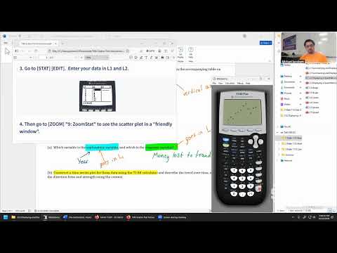
- Year is the explanatory variable on the horizontal axis; money lost to online fraud is the response variable on the vertical axis.
1:00:00
Configuring a TI-84 Scatterplot and Entering Paired Data
- Jacobsen’s TI-84 setup uses 2nd then STAT PLOT to turn Plot 1 on and choose the scatterplot icon.
- Students enter explanatory-variable values in L1 and response-variable values in L2; both lists must contain the same number of observations.
- For the 12 annual fraud observations, he checks that both lists end at L12 and clears any existing function in Y1 if necessary.
1:07:00
Displaying the Plot with ZoomStat and Reviewing Exam 2
- Selecting ZoomStat (Zoom menu, option 9) automatically scales the TI-84 display to show the complete scatterplot.
- The resulting fraud plot places year on the horizontal axis and losses on the vertical axis; students will describe its trend using direction, form, and strength.
- Jacobsen plans to review the calculator process in the next class and reminds students to schedule Exam 2 at a preferred testing center.
Summary, takeaways, and chapters were generated by AI from the video's transcript and may contain errors. The video belongs to its creator, Mike Jacobsen.