Form Styling (part 2) (9-9-2026) | CIS311
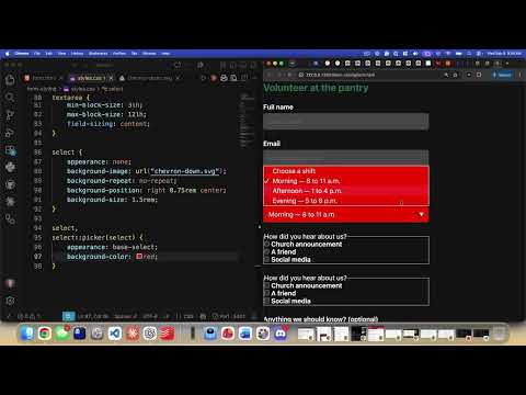 Watch on YouTube →
Overview
Kenan Casey demonstrates modern CSS techniques for styling form controls: replacing a select element’s native chevron with a positioned SVG, adjusting checkbox and radio layouts, and styling validation states. The examples use logical sizing properties, `accent-color`, `fieldset` and flexbox layout, plus `:user-invalid` and `:user-valid` to provide feedback only after interaction.
Key takeaways
- Setting `appearance: none` on a select removes its native chevron, allowing a custom SVG background to control the icon’s position and size.
- The `select::picker` and `appearance: base-select` approach can expose styling options for the opened menu, but browser support is limited.
- Logical properties such as `inline-size` and `block-size` provide width- and height-equivalent sizing while supporting different writing modes.
- Applying `accent-color: var(--brand)` gives checked radio buttons and checkboxes the site’s brand color without building custom controls from scratch.
- For validation feedback, `:user-invalid` avoids showing errors on untouched fields, while `:user-valid` can mark correctly completed fields.
Chapters
0:00
Remove the Native Select Chevron and Add a Custom SVG
- Style the `select` control’s padding, border, border radius, background color, and font size.
- Set `appearance: none` to remove the browser’s native dropdown chevron.
- Create a `chevron-down.svg` asset and use it as a CSS background image for a custom indicator.
5:20
Position the Select Icon and Explore Custom Picker Styling
- Use `background-repeat: no-repeat` and `background-position` to place the SVG at the right side of the select.
- Adjust the icon’s size and offset with `background-size` and background positioning.
- Explore `select::picker` with `appearance: base-select` to style the opened picker; Casey notes support is limited, including Chrome and Safari.
10:54
Size and Align Checkbox and Radio Choices
- Select both control types with attribute selectors: `input[type="checkbox"]` and `input[type="radio"]`.
- Set `inline-size` and `block-size` to `1.5rem`, remove padding, and apply the brand color with `accent-color: var(--brand)`.
- Use a grid layout and `gap` on `fieldset`, then make each `.choice` a flex row with spacing and centered alignment.
- Style choice labels at font weight 400 and emphasize the `legend` at weight 600; retain a border around the fieldset.
19:16
Show Form Errors After Interaction with Validation Pseudo-Classes
- Required fields trigger the browser’s built-in validation on submission without JavaScript.
- Avoid `input:invalid` for immediate error styling because required, empty fields appear invalid before the user starts the form.
- Use `input:user-invalid` to apply a warning-colored border after interaction, and `input:user-valid` to apply a brand-colored border once the value is valid.
Summary, takeaways, and chapters were generated by AI from the video's transcript and may contain errors. The video belongs to its creator, Kenan Casey.