Form Styling (part 1) (9-4-2026) | CIS311
 Watch on YouTube →
Overview
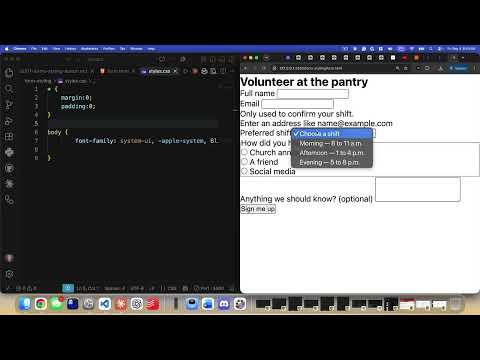
Kenan Casey builds a form-styling example using modern CSS features, including custom properties, `color-scheme`, `color-mix()`, `accent-color`, logical sizing, and `field-sizing: content`. Along the way, he styles labels and controls, improves responsive form width and spacing, and addresses practical details such as iOS input zoom and Firefox placeholder opacity.
Key takeaways
- HTML `required` provides built-in browser validation without JavaScript, though the appearance of the validation popup varies by browser.
- The combination of `color-scheme: light dark` with `Canvas` and `CanvasText` makes form surfaces and text respond to the user's system theme.
- `color-mix(in lch, ...)` can produce theme-aware muted text and border colors by blending system colors in a perceptual color space.
- Using `max-inline-size: 40ch` and grid `gap` creates a readable form layout with spacing that does not depend on fixed pixel widths.
- For iOS Safari, setting control text to at least 16 pixels prevents the browser's automatic zoom when users focus a field.
- Textarea `field-sizing: content` can make a text area expand with its content, while `min-block-size`, `max-block-size`, and `lh` units help control its dimensions.
Chapters
0:00
Form Markup, Native Validation, and a Global CSS Reset
- The example form uses `action` and `method="post"`, with each label and control grouped in a `.field` div.
- HTML `required` triggers browser-native validation without JavaScript; the form also includes email input, a select, radio buttons, a textarea, and a submit button.
- Kenan Casey links a stylesheet, sets `box-sizing: border-box`, chooses the system UI font, and recommends images use `display: block` and `max-width: 100%`.
8:48
CSS Custom Properties for Brand, Danger, and Focus Colors
- A `:root` block defines reusable CSS variables with `--name` syntax and references them using `var(--name)`.
- The brand color uses HSL values `155 45% 32%`; the danger and focus colors use separate HSL values for errors and focused controls.
- Kenan favors modern space-separated color components over comma-separated HSL syntax.
12:08
System Color Schemes and Perceptual `color-mix()`
- Setting `color-scheme: light dark` lets browser-provided foreground and background colors adapt to the user's operating-system theme.
- The `Canvas` and `CanvasText` system colors provide theme-aware surface and text values that can be stored in CSS variables.
- Kenan uses `color-mix(in lch, ...)` to create muted text and border colors, blending theme-aware colors in a perceptual color space.
21:46
Branding Native Controls with CSS `accent-color`
- Applying `accent-color: var(--brand)` to the form changes the built-in color of radio buttons and checkboxes.
- The same property can also affect controls such as range sliders and progress bars, helping native elements match the site's brand.
24:04
Form Grid Spacing and Character-Based Responsive Width
- Setting the form to `display: grid` with `gap` adds consistent spacing between its child fields.
- A `max-inline-size` around `40ch` limits line length using a text-relative unit rather than a fixed pixel width.
- Each `.field` uses its own grid and gap to space labels, controls, and help or error text; logical sizing properties adapt to writing direction.
28:47
Styling Labels, Hints, and Input Control Surfaces
- Labels receive a heavier font weight, while hint text uses the muted color variable and a smaller font size.
- Text inputs, selects, and textareas get padding, a subtle theme-aware border, a surface background, and rounded corners.
- Using `font-size: max(1rem, 16px)` keeps controls at least 16 pixels tall in text size, avoiding Safari on iOS zooming in when a field is tapped.
33:54
Placeholder Styling and Cross-Browser Form Details
- The `::placeholder` pseudo-element can style placeholder text independently, including using the muted color variable.
- Firefox applies its own placeholder opacity, so explicitly setting `opacity: 1` can make placeholder styling consistent with Chrome.
- Kenan finds a hover background distracting during typing and demonstrates adding example placeholders such as “John Smith.”
38:46
Textarea Sizing with Logical Properties and `field-sizing`
- A textarea can use `min-block-size` and `max-block-size` instead of physical height properties, with `lh` units sizing it in line heights.
- Setting `field-sizing: content` lets the textarea grow with its text, while a maximum block size limits its growth and allows internal scrolling.
- The example starts at roughly three lines and grows toward a 12-line maximum; the native resize handle can still change its size.
Summary, takeaways, and chapters were generated by AI from the video's transcript and may contain errors. The video belongs to its creator, Kenan Casey.