Math 1153 - 31 August 2026 - Section 2.1
 Watch on YouTube →
Overview
Mike Jacobsen introduces Section 2.1 on displaying categorical data, showing how to move from an unwieldy list of 1,268 car-buying survey responses to frequency and relative-frequency tables and an interpretable bar chart. He distinguishes categorical from quantitative variables, works through bar-chart interpretation in context, and uses births by weekday to discuss how scheduled inductions may explain a nonuniform pattern.
Key takeaways
- Choose a display based on what the values mean: numerical codes such as 0 and 1 can still represent categorical labels and therefore call for a bar chart.
- For the car-marketing study, category frequencies are 760 American, 375 Japanese, 72 Korean, 37 German, and 24 other, totaling 1,268 respondents.
- Relative frequency equals category count divided by the sample size; the American-car proportion is 760/1,268 = 0.5994, or about 59.94%.
- A relative-frequency table should total approximately 1, or 100%; a small mismatch can arise because each entry is rounded.
- A readable bar chart needs category labels, a meaningful vertical scale, accurate relative heights, and consistent bar widths.
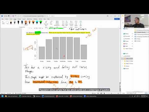
- Graph descriptions should state what the pattern means in context: lower weekend births in the 2006 city data may reflect weekday scheduling of inductions.
Chapters
0:00
Exam Testing-Center Planning and Week-Two Deadlines
- Mike Jacobsen asks online students to report their preferred in-person exam location, such as Pocatello, Idaho Falls, Twin Falls, Meridian, or an out-of-state center.
- The first exam is expected on Monday of week five; scheduling instructions will arrive during week four.
- Chapter 1 work is due Thursday, and the first weekly quiz will be posted Wednesday.
4:39
Section 2.1: Matching Data Types to Displays
- Chapter 1 introduced categorical variables such as blood type and quantitative variables such as GPA, height, and registered credits.
- Chapter 2 focuses on displaying and interpreting collected data rather than defining data types.
- Bar charts display categorical outcomes; histograms display ordered numerical measurements, typically with adjacent bins.
7:42
Choose Bar Charts for Categories and Histograms for Measurements
- Gender coded as 0 or 1 remains categorical when the numbers stand for labels, so a bar chart is appropriate.
- Age recorded in years and height recorded in inches are quantitative, making histograms suitable displays.
- Blood type is categorical, so its outcomes belong in a bar chart; brief explanations such as “categorical data” are sufficient.
17:19
A Car-Marketing Study Begins with 1,268 Raw Responses
- An automobile marketing firm records the prior car type owned by people who subsequently bought an American car.
- The data file lists 1,268 subjects and categories including American, Japanese, Korean, German, and other cars.
- The study’s purpose is to help the firm understand customers and make better-informed decisions about American-car marketing.
22:00
Why Scrolling Through Raw Categorical Data Is Not Enough
- A long sequence of 1,268 labels makes it difficult to estimate category proportions or notice less common outcomes reliably.
- Visual impressions such as “more than half were American” or “Japanese is about 17%” need to be checked by counting.
- Frequency tables and graphical displays summarize the data so the marketing firm can make decisions from a clearer account.
27:32
Build a Frequency Table and Find the Sample Size
- Frequency means the number of times a category occurs; the software-generated counts are American 760, Japanese 375, Korean 72, German 37, and other 24.
- Adding all five frequencies gives 1,268 observations, the sample size for this study.
- The frequency table reveals that American and Japanese prior cars dominate the responses, unlike a visual scan of the raw file.
31:35
Relative Frequency Converts Counts into Proportions
- Relative frequency is a category’s frequency divided by the total number of observations, here 1,268.
- A proportion can be converted to a percentage by multiplying by 100; the MyLab exercise requests proportions.
- Jacobsen emphasizes following the requested rounding precision because an otherwise correct answer can be rejected for formatting.
32:40
Calculate and Round the Largest Car-Category Proportions
- American cars: 760 ÷ 1,268 rounds to 0.5994 at four decimal places, or about 59.94%.
- Japanese cars: 375 ÷ 1,268 rounds to 0.2957 at four decimal places.
- For four-decimal rounding, inspect the digit immediately after the fourth decimal place; Jacobsen recommends asking for help if MyLab rejects a result that may only differ by rounding.
36:35
Complete the Relative-Frequency Table and Check Its Total
- The remaining proportions are Korean 0.0568, German 0.0292, and other 0.0189, each rounded to four decimal places.
- The rounded relative frequencies should sum to approximately 1, or 100%; small discrepancies can result from rounding.
- The proportions show that nearly 60% of respondents already owned an American car, while Japanese-car owners account for about 30%.
41:01
Set Up a Relative-Frequency Bar Chart
- Place the five car categories—American, Japanese, Korean, German, and other—on the horizontal axis.
- Use relative frequency on the vertical axis, with a scale from 0 to 1 and tick marks such as 0.1.
- The category labels and a suitable numerical scale make the chart interpretable; hand-drawn bars need only approximate the correct heights.
45:48
Plot Bar Heights Accurately and Keep Widths Consistent
- The American bar should reach about 0.60 and the Japanese bar about 0.30; noticeably reversing their relative sizes would misrepresent the data.
- Keep bar widths approximately equal because viewers can be misled by bar area as well as height.
- Small categories need careful scaling: Korean is about 0.057, German about 0.029, and other about 0.019, so the last two bars may appear nearly flat.
51:20
Interpret the Car Chart Using the Study Context
- A valid contextual conclusion is that American cars were the most common previous-car category among the 1,268 people who bought an American car.
- Korean, German, and other cars have much smaller shares than American and Japanese cars.
- An answer should name the actual car categories rather than refer vaguely to the “first bar” or “largest category”; one supported observation can suffice unless more are requested.
57:39
Weekday Births Suggest Scheduled Inductions and Preview Section 2.2
- A second categorical example records births by day of the week in a U.S. city during 2006; the weekday categories are displayed with frequencies.
- The bar chart has fewer births on Saturday and Sunday and a rise-and-fall pattern across the workweek.
- Jacobsen suggests that scheduled inductions from Monday through Friday may help explain the pattern, while stressing that graph interpretations should connect observations to context.
- Section 2.2 will shift to quantitative data displays, including histograms and dot plots, and later use calculators for sample means and standard deviations.
Summary, takeaways, and chapters were generated by AI from the video's transcript and may contain errors. The video belongs to its creator, Mike Jacobsen.