Math 1153 - 1 September 2026 - Section 2.1
 Watch on YouTube →
Overview
Mike Jacobsen introduces graphical methods for quantitative data in Section 2.1, building a dot plot of age at early-onset dementia diagnosis for 21 people and explaining how to describe its center, spread, left skew, and possible outliers. He distinguishes histograms from categorical bar charts, interprets examples involving synovial-fluid pH and cesium contamination in Pacific bluefin tuna, and shows why defining a study’s population and sample matters for inference.
Key takeaways
- For 21 people diagnosed with early-onset dementia, ages ranged from 41 to 61 years and clustered near 58–60, with a tail toward younger ages that makes the distribution left-skewed.
- A dot plot places one dot per observation on a number line and stacks repeated values; the age 58 observation occurred most often in the dementia example.
- Histograms suit quantitative data because their bars represent numeric intervals; a gap between bars indicates an interval with no observations, unlike the category gaps in a bar chart.
- The synovial-fluid pH histogram indicates one subject above pH 7.6 and suggests that most subjects fall roughly between pH 7.0 and 7.5, although binning hides exact measurements.
- A study population must include relevant geography and time: the tuna population was Pacific bluefin tuna near California four months after the 2011 Fukushima meltdown, while the sample was the 15 fish caught.
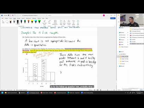
- The tuna cesium histogram is bimodal, with clusters around 6–8 and 10–12 becquerels per kilogram; all sampled values exceed the historical 2-becquerel benchmark, but formal inference is needed to establish a population-mean difference.
Chapters
0:00
Class Setup, Quiz Announcement, and Section 2.1 Roadmap
- Mike Jacobsen apologizes for a roughly 10-minute delay caused by camera and software problems and plans to restart the camera before future classes.
- A quiz is scheduled to be posted Wednesday and discussed Thursday; Jacobsen also previews calculator-based statistics in upcoming quantitative-data sections.
- The class shifts from categorical data to numerical measurements for which averages and standard deviations make sense.
2:59
Dot-Plot Example: Ages at Early-Onset Dementia Diagnosis
- The data record age at diagnosis in years for a simple random sample of 21 people with early-onset dementia.
- Jacobsen explains that quantitative variables have numerical values with meaningful units, unlike categorical responses.
- A graph can reveal patterns that are difficult to see in a raw list, including where ages cluster and how widely they vary.
7:38
Choosing a Useful Scale for the Age Dot Plot
- The observed ages run from 41 to 61 years, so Jacobsen builds a horizontal axis that contains the full range.
- He labels the axis “age at diagnosis in years” to make the variable and unit explicit.
- Tick marks every five years—from 40 through 65—provide useful detail without crowding the display with a mark for every year.
12:32
Plotting Individual Ages and Stacking Repeated Values
- Each of the 21 observations becomes one dot positioned above its age on the number line.
- Repeated ages are stacked vertically; for example, several people in the sample were diagnosed at age 58.
- Dots need only be placed in the correct approximate positions, but checking off observations helps avoid missing or duplicating data.
17:10
Reading the Dementia-Age Distribution: Left Skew and Center
- The completed display has a main cluster around ages 58–60 and a longer tail toward younger diagnosis ages, so Jacobsen describes it as skewed left.
- The minimum and maximum ages—41 and 61 years—communicate the overall spread of diagnosis ages in the sample.
- A graph helps estimate the distribution’s center and spread, but a contextual description should refer to ages at early-onset dementia diagnosis.
22:30
Using Mode and Outliers to Describe a Dot Plot
- Age 58 is the most frequent diagnosis age in the sample; the most frequently occurring observation is called the mode.
- A hypothetical diagnosis age in the late 20s or 30s, far from the main group, would be a potential outlier worth mentioning.
- A useful description can note the mode, the range, the direction of skew, or unusual values, while tying claims to the study context.
27:20
Histograms Versus Bar Charts: Synovial-Fluid pH Example
- A histogram displays quantitative measurements along a number line and uses bar height to show how many observations fall within each interval.
- Unlike a categorical bar chart, histogram bars generally touch; a gap indicates an interval with no observations.
- The example measures pH in synovial fluid taken from the knees of people with rheumatoid arthritis, an autoimmune disease affecting joints.
35:46
Reading pH Histogram Frequencies and Typical Ranges
- The histogram shows one subject with synovial-fluid pH above 7.6; frequency is read from the height of the corresponding bar.
- An interval around pH 7.1–7.25 contains about five observations, illustrating how to translate a bar into a count and range.
- A reasonable approximate range for most subjects is pH 7.0–7.5, though grouped histogram bars do not reveal each person’s exact pH.
41:40
Fukushima Cesium Measurements in Pacific Bluefin Tuna
- A second example studies cesium-134 and cesium-137 concentrations in a random sample of 15 Pacific bluefin tuna caught off California.
- The fish were sampled four months after the 2011 Fukushima nuclear disaster; measurements are in becquerels per kilogram of dry tissue.
- Because the concentration has meaningful numerical units and an average is interpretable, the variable is quantitative.
48:19
Defining the Tuna Study’s Population and Sample
- The population is Pacific bluefin tuna near the California coast four months after the 2011 Fukushima meltdown—not tuna everywhere or at every time.
- The sample is the 15 fish caught for the study; describing the population precisely makes this sample description concise.
- Population definitions may depend on geography and time because migratory fish and radioactive contamination levels vary across locations and periods.
52:38
Why Tuna Concentration Data Need a Histogram
- A bar chart is inappropriate because the cesium concentrations are quantitative; appropriate displays include a histogram, dot plot, or box plot.
- The histogram has two prominent clusters, approximately 6–8 and 10–12 becquerels per kilogram, so the distribution is bimodal.
- Descriptions should identify the measured context—radioactivity in tuna tissue—and may also report clusters, range, or other visible features.
57:00
Interpreting the Mean and Previewing TI-84 Statistics
- All sampled tuna measurements exceed the historical mean benchmark of 2 becquerels per kilogram; the histogram’s lowest interval begins around 4, while the raw minimum is 4.6.
- The sample mean appears to be around 10, providing preliminary evidence that the population mean exceeded 2, but a formal statistical procedure is needed for a firm conclusion.
- Upcoming work will calculate sample means and standard deviations with a TI-84 calculator.
Summary, takeaways, and chapters were generated by AI from the video's transcript and may contain errors. The video belongs to its creator, Mike Jacobsen.