Grid & Subgrid (10-7-2026) | CIS311
 Watch on YouTube →
Overview
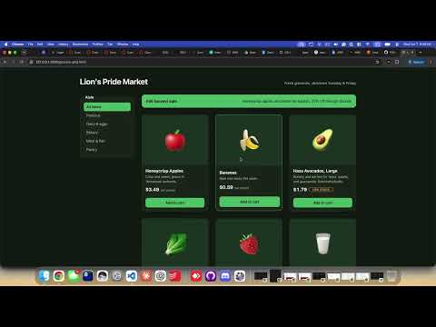
Kenan Casey builds a responsive grocery product grid with CSS Grid techniques that reduce reliance on viewport breakpoints: `repeat()` with `auto-fill` and `minmax()`, full-width placement, and `subgrid` for aligning card content. He also demonstrates design tokens and LCH colors, container queries for component-level adaptation, and accessibility features including reduced-motion preferences and screen-reader handling.
Key takeaways
- For a responsive card grid, `repeat(auto-fill, minmax(min(100%, 320px), 1fr))` can automatically choose the number of columns, let cards expand, and avoid overflow on containers narrower than the preferred minimum.
- `grid-column: 1 / -1` makes a promotional item span every current grid column without needing to know how many columns `auto-fill` created.
- CSS `subgrid` lets product cards reuse parent row tracks; having each card span four tracks aligns internal content across cards with different amounts of text.
- Container queries let a component respond to its own width: Casey’s price row switches between long and abbreviated unit labels at 226px, independently of viewport breakpoints.
- CSS custom properties centralize design values such as gap sizes and border radii, while LCH and `light-dark()` support coordinated color choices across light and dark modes.
- Accessibility can be built into the interface with `prefers-reduced-motion`, `aria-hidden="true"` for decorative emoji, and CSS that honors JavaScript-applied `hidden` attributes.
Chapters
0:00
Grocery Page Structure and the Outer Grid
- The page wrapper contains a header, product filters, a `main` products area, and a footer.
- The outer layout uses named grid template areas and `auto 1fr auto` rows so the header and footer fit their content while the main area takes remaining height.
- At a maximum width of 700px, the page switches from a two-column layout to a single column and adjusts its row sizing.
5:05
Responsive Product Columns with `auto-fill` and `minmax()`
- A fixed `repeat(3, 220px)` layout creates three narrow columns and can cause horizontal scrolling on smaller screens.
- `minmax(220px, 1fr)` lets each column grow into available space while preserving a 220px minimum.
- Using `repeat(auto-fill, minmax(...))` lets CSS fit as many columns as the available width allows, changing from four columns to three or two without product-grid media queries.
- The page’s 1280px maximum width and a shared column-gap variable help govern the available space and spacing.
11:00
Shared CSS Tokens and LCH Color Definitions
- CSS custom properties define reusable design tokens such as background, surface, text, muted colors, gaps, and border radii.
- Changing a shared gap token updates spacing across the layout; Casey demonstrates increasing it from `1rem` to `1.5rem`.
- The stylesheet uses LCH color values—lightness, chroma, and hue—to define colors in a perceptually oriented color model.
- `light-dark()` provides distinct color values for light and dark modes instead of simply inverting the same palette.
16:36
Preventing Overflow with a Flexible Minimum Track Size
- A fixed 220px minimum can still overflow on extremely narrow screens because grid tracks will not shrink below their declared minimum.
- Using `min(100%, 320px)` as the minimum lets a card shrink below 320px when its container is narrower.
- The resulting track pattern combines that flexible minimum with a `1fr` maximum, so cards fill available space without forcing horizontal scrolling.
19:48
Making the Promotional Banner Span Every Auto-Filled Column
- The harvest-sale promo is a sibling of the product cards inside `main`, but it needs to occupy the full product-grid width.
- `grid-column: 1 / -1` stretches the promo from the first grid line to the last, regardless of whether the layout currently has two, three, or four columns.
- The `-1` endpoint avoids hard-coding a final column number when `auto-fill` changes the grid.
21:25
Aligning Product Card Rows with CSS `subgrid`
- Cards with different amounts of text can produce mismatched image and information-area heights in the product grid.
- Setting a card’s row template to `subgrid` makes its internal grid reuse tracks from the parent grid.
- The card spans four parent rows so elements such as the image, title and details, and price align consistently across neighboring cards.
- This alignment relies on the shared grid structure rather than separate sizing rules for each card.
28:40
Using Container Queries for Card-Level Adaptation
- `container-type: inline-size` makes the price row a queryable container based on its width rather than the viewport.
- A container query at 226px switches between long and short unit labels, such as “per pound” and “/lb.”
- The same component-level approach adjusts heading size when a card has more room, even when viewport width alone would not predict the card’s size.
- Container queries suit reusable cards because their layout depends on each card’s actual container width.
35:10
Supporting Reduced Motion and Accessible Product Filtering
- A `prefers-reduced-motion` media query respects the operating-system accessibility setting by suppressing card hover animation for users who request reduced motion.
- Without that preference, card hover styling animates border color and shifts the card upward by 2px.
- Product images are emojis, so `aria-hidden="true"` prevents screen readers from announcing decorative emoji as text.
- JavaScript applies the `hidden` attribute when filters are selected, and CSS explicitly ensures elements with that attribute are not displayed.
Summary, takeaways, and chapters were generated by AI from the video's transcript and may contain errors. The video belongs to its creator, Kenan Casey.